
There is more environmental justice data available than ever before. However, the data lives in different locations on the internet and among different federal, state, and local agencies. It is often hard to access and to understand.
To help communities access and use data, E2I2 provides communities with targeted GIS maps for a variety of pollutants, for example toxic air emissions from Toxic Release Inventory (TRI) reporting facilities and facilities that emit greenhouse gases (GHG), to mention just two.
The maps we produce are specific to a community’s boundaries and pollutants of concern. We also map the pollutants on top of socio-demographic characteristics, for example people of color and people living below the poverty level. These analyses provide powerful visualization of which groups of people are most impacted by localized polluting facilities.

Ongoing GIS mapping projects include:
For 10 Parishes in Louisiana for the Deep South Center for Environmental Justice, GIS mapping of TRI and GHG on top of social and demographic characteristics, as well as social vulnerability index (SVI), social vulnerability module (SVM), and environmental burden model (EBM).
For The Bullard Center at Texas Southern University, mapping of TRI, GHG, SVI, SVM, EBM around 86 proposed or under construction petrochemical facilities.
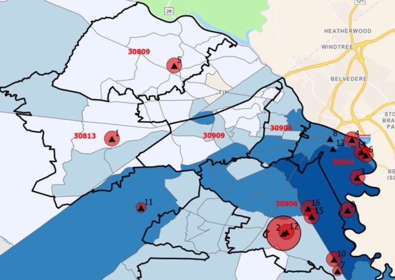
For Healthy Communities of Augusta and the Savannah Riverkeeper, the mapping of TRI and GHG on top of the percentage racial and ethnic minority and percentage below the Federal poverty level.
DATA ANALYSIS
In addition to mapping, we
access data that helps each community tell their environmental injustice
stories. For example, we use the Climate and Economic Justice Screening Tool
(CEJST) to help describe each community’s environmental burden. We also pull data
from the EPA’s EJScreen for specific community zip codes and compare the data
to national and state averages so communities can see how they fare compared to
their neighbors and the wider state.
To make the data most
usable for communities, we package the data in a variety of formats depending
on the community’s needs. These formats include plain language reports,
explanatory PowerPoint presentations, and develop community cloud-based portals
to visualize the data and provide ongoing access to all community members. We
provided tailored wraparound data literacy education and training to ensure the
data is usable for communities.

